Google finally gives in to one of the biggest requests from users for Chrome. You can now put the address bar at the bottom
You can try this change now in Google Chrome Canary

In Google Chrome for Android, the address bar has always been at the top, with the sole exception of an experiment that began in 2016 called Chrome Home internally. The experiment unfortunately came to nothing, but Google has revived the idea of putting the address bar at the bottom once again.
On today’s phones, one-handed use can be a bit tricky. One of the simplest solutions to the problem is to put navigation at the bottom, something Google recently did with Google Maps . Google Chrome could be next, if this time the experiment goes ahead.
Address bar dream returns for Google Chrome
There are those who prefer to have the address bar at the top and those who prefer to have it at the bottom. The latter have had to look for another web browser , since the Chrome Home experiment , a Chrome flag that became quite popular back in 2016, unfortunately ended up disappearing. Since then, there was no way to change the location of the address bar. Until now.
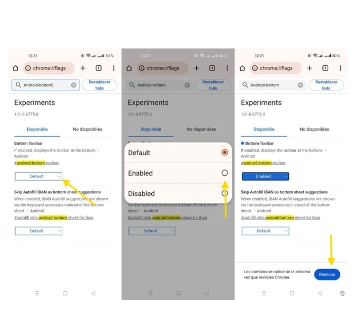
Google is once again testing the option to put the address bar at the bottom in Chrome , something you can now try yourself with the latest version of Chrome Canary. You’ll need to open chrome://flags and look for the flag called Bottom Toolbar or #android-bottom-toolbar . You’ll need to mark it as enabled.

You will need to reboot for the changes to take effect , although in my case this was not enough and I also had to force close the app and clear its cache. It is common for some of these Chrome Flags to require two reboots to apply the changes.
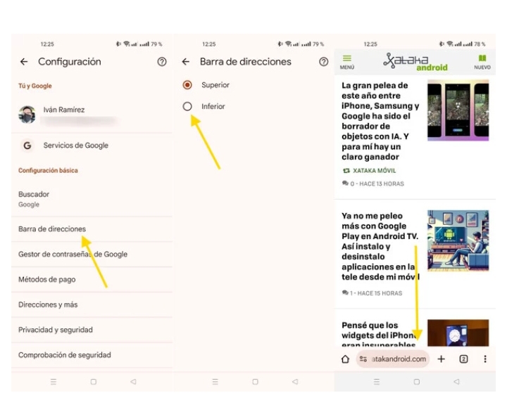
You will then see that there is a new item in Google Chrome settings called Address Bar. Here you can choose whether you want a top or bottom address bar , as you like.
The bottom address bar is… basically the same as the top one, but down below , with the main advantage being that it should be easier to access when holding the phone in one hand. The context menu is aligned to the bottom and when typing an address, the full-screen layout is the same as always.

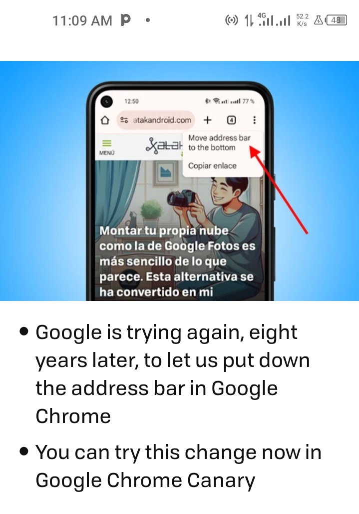
And if you want to change its location from top to bottom, you can opt for a long tap on the address bar , which brings up a context menu to move the bar to the top or bottom, as appropriate.
Placing the address bar at the bottom is an experiment again some eight years after the last one and there is still no guarantee that the idea will succeed this time. However, the fact that Google is trying again gives hope to those who have been waiting for years for it to take hold.

